
So for my substack Mind Explorer newsletter, I bought the 20th anniversary edition of Revelation for Everyone, a narrative non-fiction book with the study guide. A two-for-one! I kind of wrote a similar book with my revised edition for Concussion Is Brain Injury: Treating the Neurons and Me. I spent a lot of time researching and designing my book for it to be as an accessible a read as possible.
These editors not so much.

I flip open the book, and the first thing I see is no white space! I mean, what were the book designers thinking?! White space — that is, space between lines, letters, and edges of the page and text — is crucial to legibility and the physical act of reading. Publishers have known that since, well, forever. Oh, I thought, maybe this is self-published?
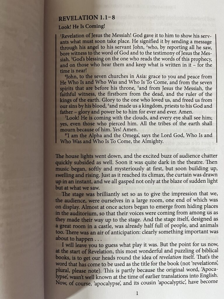
I flip to the copyright page. Nope. That’s a publisher who chose cost over function. Smoosh the letters and lines together to reduce page count and thus print cost. Doesn’t make for a friendly paperback. In fact, when publishers eliminate white space, it’s like they stick magnets on the page to repel eyeballs and persuade hands to shut the book fast.
Well, at least it has the study guide integrated, I thought. That should make it easier to read and get to the relevant questions, right? Hahahahaha!
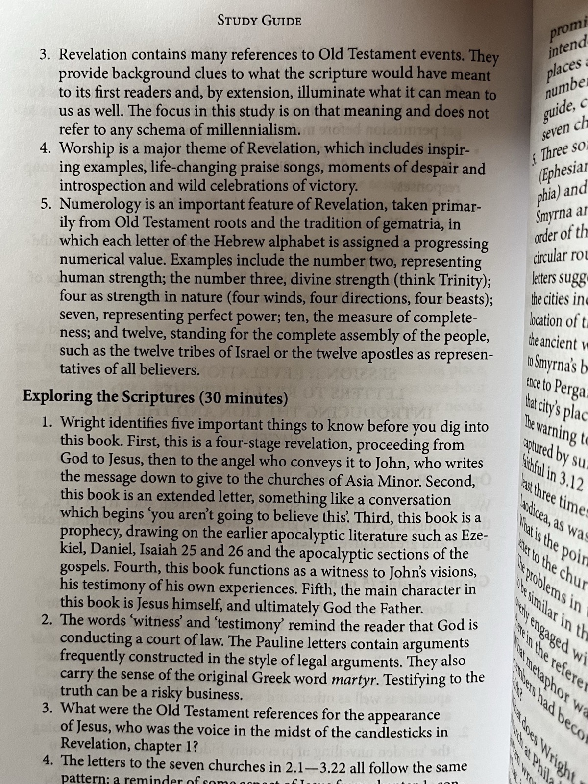
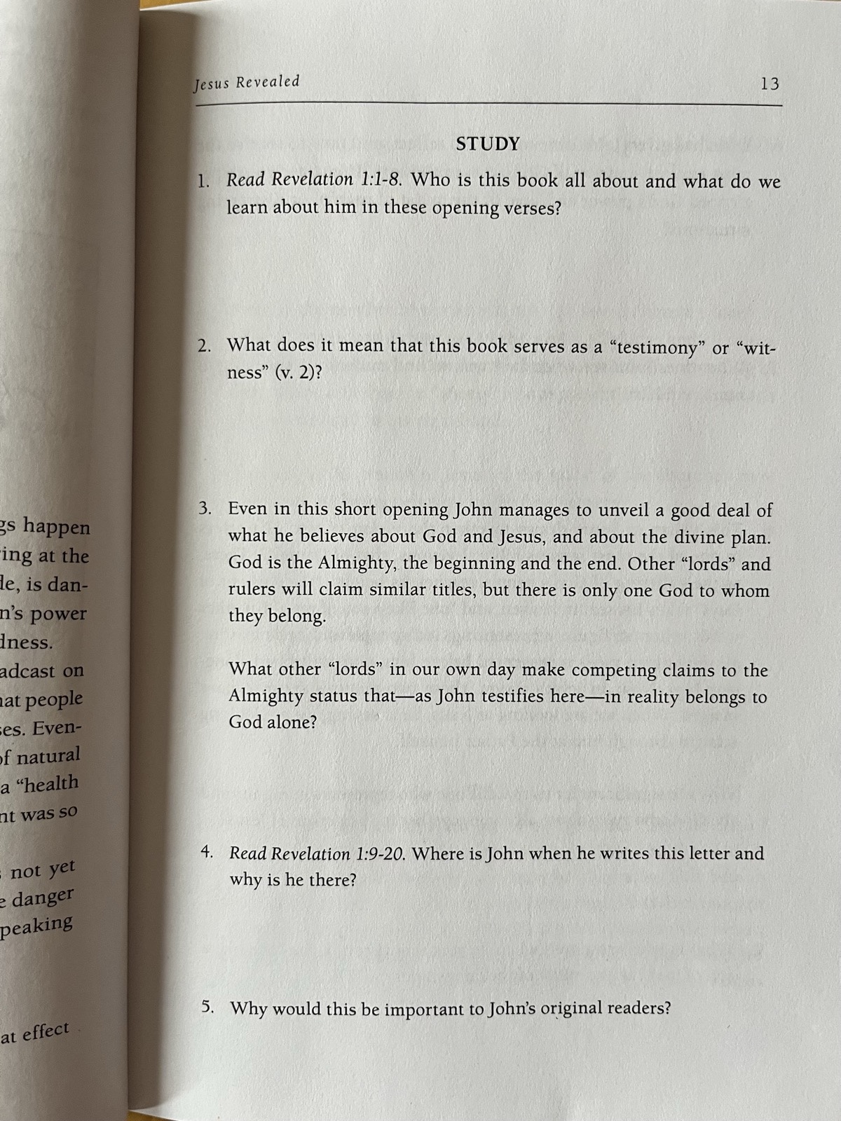
Yeah, the study guide is there — at the back of the book!
Who thought separating the narrative from the questions was a good idea? It’s like they stuck the two books together back to back, eliminated white space, used some generic font, and called it a special edition. Lazy and a gyp for the reader.

Just checked the “new” study guide again. It’s even less well-thought-out than the original. The 20th anniversary edition version on the left; the original study guide only on the right. Both showing the first questions on Revelation 1. Slide the slider back and forth. Which do you think has readable questions?
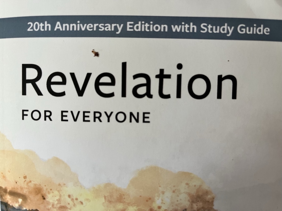
Special anniversary editions should be beautifully designed, enticing to read, and not use what looks like Times New Roman. I mean, what legitimate book publisher uses that font anymore?! Even oodles of websites advise self-publishers not to use it. I personally used Rosarivo and then Cormorant when a reader noted the latter was easier to read.
A thoughtful publisher creating a 20th anniversary edition that combines two books would integrate them, not slap them together back to back. That means they’d put the relevant questions at the end of each translation and exposition; an editor would rethink the study guide as a part of the narrative, an end section before the next translation. That’s what special editions are about. Improving on the original!
Paperbacks aren’t cheap. I’m so incensed at spending my scarce bucks on this harder-to-read book that I whipped over to my website to vent on here instead of moving on to the next question for my Mind Explorer Substack newsletter! Seriously.
Was the publisher thinking about readability at all?!
Perhaps the paltry pay plus the pandemic has put paid to editors and designers who know what they’re doing. Instead, publishers are hiring young ‘uns who have no background in graphic design and publishing but do understand dollars (or pounds in this case)?! At least they sprang for cover art. The more to fool us into thinking this is a special edition. *Fuming*
