Kerry, a Board member of BIST (Brain Injury Society of Toronto), and I attended the TTC Public Forum on Accessible Transit back on 16 September 2015. I had spoken to one of the BIST Board members a few months previously about TTC accessibility, and he’d suggested I attend accessibility meetings. I told him this was one area I couldn’t do alone. I have to do most things by myself; I’m overloaded. I can’t do one more thing on my own. The Board took that to heart, and Kerry invited me to attend the Forum with her and drove me there. What a difference it makes to have someone with you! Not being alone buoys you up, gives you the ability to spend precious energy on the activity not as much on getting there and back, means you have someone to hash over a shared experience, helps you think, and empowers you to participate in society in person, not just virtually. This is what a person with brain injury needs. Heck, anyone needs!
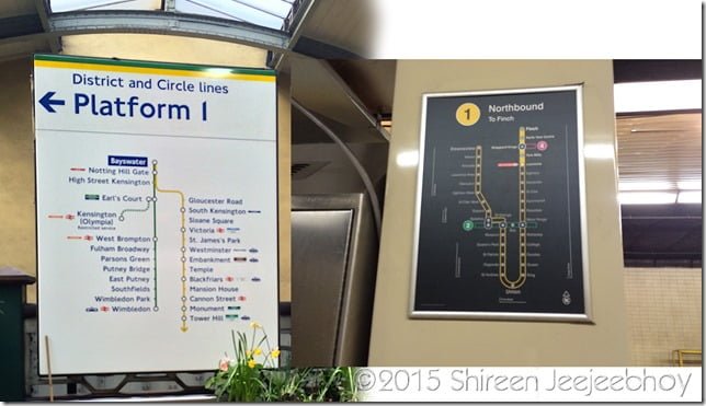
I had never attended one of these Forums before – Kerry had a long time ago – and it was instructive. I wrote extensively, with pretty pictures, on my political blog about what I saw and learnt, about the conversations I had with TTC staff about the cognitive inaccessibility of subway line names, signage, streetcar stop request buttons, and the TTC’s pilot of new streetcar shelter maps. Here are the key points:
- TTC staff were there, talking to attendees with visual, cognitive, and physical accessibility problems on the TTC. And the top management were there listening to complaints and noting down questions. (The TTC will post their answers in the first quarter of 2016.) But the TTC Commissioners with the exception of TTC Chair Josh Colle and Councillor Shelley Carroll, were absent. And yes, the Forum is legally mandated, but the staff showed up, while, politicians — who represent the people — did not with the rare exception.
- Despite Mayor John Tory’s avowed interest in accessibility, he and members of Toronto Council were largely absent from the forum on the biggest accessibility issue the city faces.
- Politicians pay lip service to physical accessibility; are unaware of cognitive accessibility; don’t care to hear directly from the public.
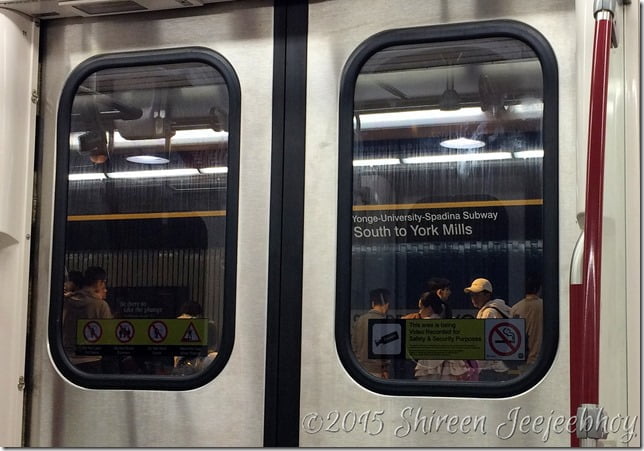
- The changing of subway line names to context-less, abstract numbers was a design decision and didn’t take into account how people remember and navigate their environment. The TTC needed a unifier and thought numbers was it. Um, no.
- The TTC has a problem of replication of names, for example, St. Clair station and St. Clair West station. Once the Crosstown opens up and if they named it the Eglinton line, there would be Eglinton station, Eglinton West station, and the Eglinton line. There’s a singular lack of imagination in naming stations and lines to retain context but make them distinguishable without resorting to incomprehensible numbers.
- The TTC believes white text on black is the easiest to see. It is in certain kinds of design but not for maps, especially when they’re small and above your head.

- The design team at the TTC aren’t fully aware of all the research on memory, navigation, the distinguishability of colours depending on use, and so on.
- This might explain why signage seems to be a constant work in progress over the decades and why it’s not visually and cognitively accessible, with certain rare exceptions.

- The TTC is trying to make shelter maps more useful and haven’t received much feedback from the public on their pilot program. Apparently, they usually do.
- There’s a new international standard for Exit signs that the TTC is implementing. I saw these green, running-man signs on the London Underground. There was a big difference between the ones on the Underground and the one I saw at Bloor station: size. Size matters when you’re panicking and running from a crisis. The bigger the sign and the closer to eye level it is, the easier it is to see. The TTC seems to think in its design decisions that they have less room than they actually do. Yes, stations built in the 1950s are small, but so are Underground stations built decades earlier, yet the Underground makes its maps full wall-height size and its running-man Exit signs very big and places them at eye level.

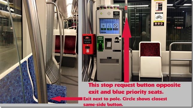
- The streetcar stop request buttons were placed according to a math equation not on practical use. I don’t think new vehicle designs are tested by real-world people with cognitive, visual, auditory, and other physical challenges.

- The button on the doors of the new streetcars serve as stop request buttons in between stops. Who knew! Not the person standing in front of the door who walked across the aisle to press the stop request button and then returned to her spot in front of the doors. Who can blame her for not knowing – there’s no sign telling you.
- The TTC wants to be a beacon for transit systems around the world. Uh, the TTC needs to get basic accessibility down first. “Beacon” is a long, long, looonnnnggg way off.
Update (27/10/2015):
If you want to add your voice and help make the TTC accessible to everyone, here are some contacts and ideas:
CBC radio (and I think Toronto news too) don’t use subway line numbers but their names, maybe because I brought it up with them as an accessibility issue. Metro Morning said accessibility is important to them when I tweeted them about this. If you hear your favourite radio or TV news show using subway line numbers, tweet them (easiest), email, or call them to object and tell them it’s an accessibility issue and they should use the proper subway line names. Tell them they make it cognitively challenging and worsen the accessibility of the TTC when they use subway line numbers instead of names.
Here’s the contact details for the TTC people I tweet the most (their email addresses are on their Twitter profiles):
Ian Dickson, Manager, Design and Wayfinding: https://twitter.com/ttcdesign
Brad Ross, Head of Communications: https://twitter.com/bradttc
Below are the Twitter feeds for TTC Help. When they use line numbers and I see it, I RT their tweets with the line names and the hashtag #accessibility or I will ask them to use the line names. I noticed during the election that David Lepofsky is the king of repetition, and he gets results.
For help with questions and concerns 7am-10pm 7 days/week: https://twitter.com/TTChelps
For service updates (which I at times RT with the line names and #accessibility added): https://twitter.com/TTCnotices
Follow David Lepofsky at https://twitter.com/DavidLepofsky for accessibility info.


